<< Back to Media
New Branding for Washington Business Dynamics
August 25, 2020
As Washington Business Dynamics continues to evolve, so has our branding. Our new logo reflects our dexterity and reaffirms our commitment to our values.
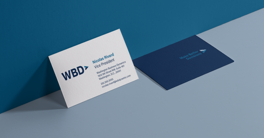
While many elements of our brand have remained constant, we have strategically updated key areas. Our new logo has been designed to be readable and eye-catching, differentiating us in a worldwide context. The arrow element, which was taken directly from our previous logo, has been updated in a contemporary way. The arrow symbolizes motivation and growth, while the beveled effect represents our multi-faceted approach. Combined with our new typemark, our logo positions WBD as a company that is straightforward yet innovative.
![]()
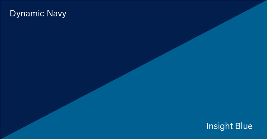
WBD’s new color palette draws inspiration from our previous palette. These colors have been refreshed for a modern context. Two shades of blues, Dynamic Navy and Insight Blue, represent our commitment to inventive yet trusted decision-making.
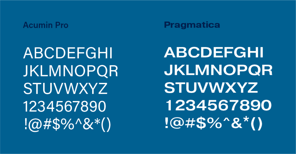
Typography is an integral component of any brand, so special care was taken to choose typefaces that reflect WBD. The Pragmatica typeface family, selected for its versatility, is used as the base form of the WBD typemark. Acumin Pro was selected as a complement, and brings a fresh, modern feel to our brand.
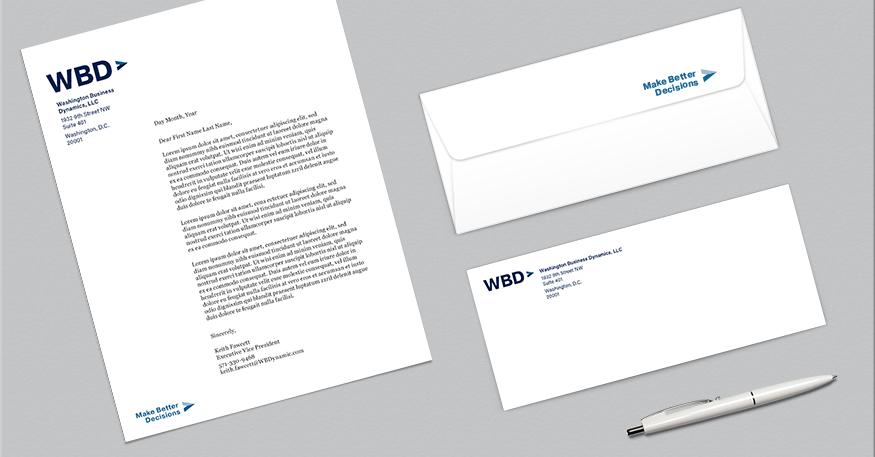
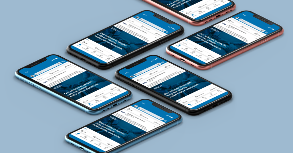
Our new branding also calls for original ways to apply the WBD brand. Our imagery showcases the impact of authenticity. To create cohesion across the brand, we’ve introduced two secondary visual elements: blue duotone treatments and diagonal overlays. When applied to our imagery, this encompasses the many different elements of the WBD brand.
Although our look has changed, our commitment to our mission remains the same. We continue to seek ways to help our clients be more innovative, agile, and motivated. Our new logo renews our commitment to our clients and these ideals.